
Mokuhanga Studies #1
Like I said in my introductory blog, I want to experiment with Japanese printmaking or ‘mokuhanga’. These types of prints have such a distinct look and feel to them and I love the watercolour-like aesthetic that you can achieve with them as well.


Thankfully, I had everything I needed already, so there was nothing to delay me getting stuck in!
I had notes I had gathered from way back in college (and what I remembered from YouTube videos I had watched a few months ago) by my side to reference from as I worked. I had pigments bought MANY months ago that I had never opened, nori paste, a baren, some brushes, a woodblock I had already carved (again, from MANY months ago), some water, a yoghurt carton to mix my pigments in, and plenty of paper. (Can you tell I was procrastinating just a wee bit?)
I also set aside a separate piece of paper that I could test out the strength or lightness of my pigments as I mixed them and added varying amounts of water.
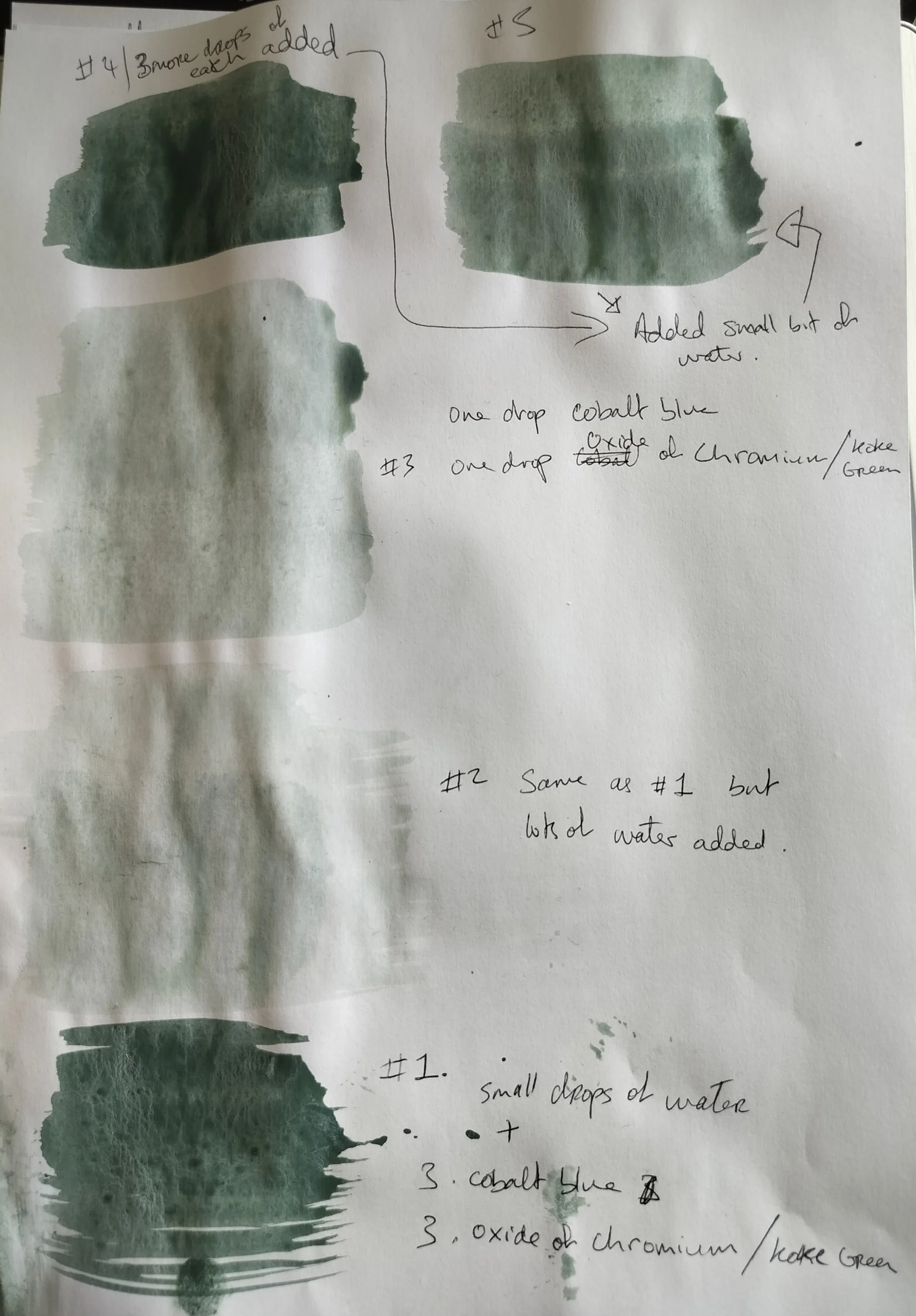
So, I chose two colours from my set to mix: cobalt blue and oxide of chromium (it was also labeled koke green on the back so I might just call it that from now on.)
#1. To get my preferred colour, I mixed 3 drops cobalt blue and 3 drops koke green into my container (a washed out yoghurt tub) and with a brush (that I had already dipped into water) I mixed the two. That was the darkest colour on the page.
#2. Then I watered it down by adding more water into the tub. This greatly reduced the intensity and opaqueness.
#3. It was a bit too watery for my taste though, so I added an extra drop of each of the colours.
This third mixture was what I used to start printing with.
#4. During the printing process, I added three more drops of each pigment to strengthen the colour.
#5. I added a small bit of water just to lighten it a smidge.
There was no right or wrong way to find the colour, just a bit of trial and error and a bit of figuring out to do. This was my first time using these pigments and mixing them. I’m used to ink and white spirits, not pigments and water, so this is a whole new world I’m stepping into. (Although, it is very watercolour-like.)


I pulled 5 prints from this test, ( 1st-5th going from left to right). The images above are when the prints were still wet. And the images below were taken when then prints dried.


The first three came out very faint. That was when I added more pigment to my mix. 4 and 5 are much stronger and the lines more defined.
But I don’t think I can chalk it up to pigment strength alone.
With the woodblock that I was using, I had never printed on it before. It was fresh and new. So, even before I started mixing colours or even printing, I had brushed water over it and left the water to soak. This is supposed to hold the pigment better when you go to print. I have NO idea if I added enough water to the block. This, I believe, is something you can only know from experience.
Then, when I was ‘inking up’ the block, I had read in my notes that the first ‘pull’ was not going to be very strong. This is because, with a new block, it takes time for the pigment to seep into it. It takes a few goes before the block is ‘loaded’ enough to hold onto the pigment and produce an even print.

I learned a lot from this little session —I even wrote a load of notes afterwards while everything was still fresh in my mind!

What did I learn?
Well, for starters, I should probably read my notes beforehand and not skim through them when I’m in the middle of printing…
When I first started inking up, I had no idea how much nori paste to put on. And even afterwards, I still don’t know. First I only but a little bit on, then by the end I think I was pretty liberal with it. Did I see a difference? …Kinda? I feel like I have to work with it more.
Something concrete that I did learn was that, when applying my mixed up pigment I used the same brush I mixed it with… yeah, that was a mistake. There I was, slathering it on, when I realised oops, I was using the wrong brush. I should have been using a sosaku bake brush, which is handleless. Also, I was putting way too much pigment on the block. You don’t actually need that much. Otherwise, it just pools in the larger carved out areas.
From all the prints I pulled, I could see areas where I did not carve deep enough, which is why you can see lines appear on the lady’s body when it should be clear. This was also along the edges, but for that, I think I can just put a strip of paper to cover those bits when printing, so there is no transferal.
I also need to take into consideration the quality of paper I was using. For these testers, I used ordinary copy paper, the ones you buy in stacks that you put into your home printer. If I was printing seriously, I would have used higher quality paper and also wetted it beforehand to help with the absorption during the printing process.
My notes also mentioned that the last few strokes should go along the grain… which I read as with the grain… oops. But, honestly, I didn’t see much of a difference. Probably because I was working with a lot of other variables. If I could get everything else right, then I could focus on that and fine tune it.
Aaaaand next time I will add less water. I think it would have been better if the colour was stronger.
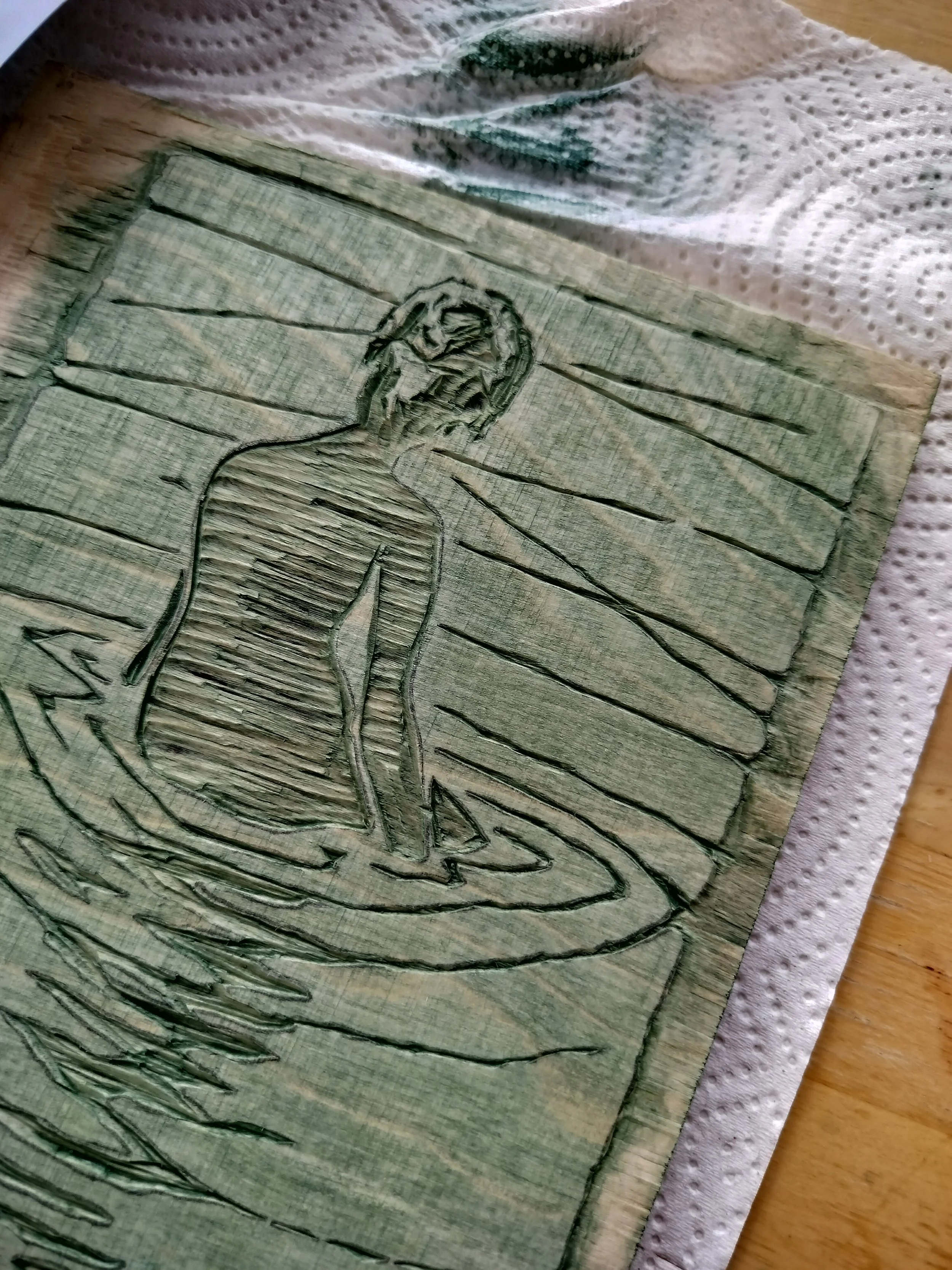
Btw, this woodblock design isn’t mine. This is me just copying a famous print by Ichijo Narumi (1877-1910).
I chose it because it only has two colours (the hair is supposed to be black but I never got around to it) and the lines seemed like something a beginner like me could work with. (I’ve always carved mdf, never proper wood.)
And that was my first toe-dip into mokuhanga!
I’m looking forward to tweaking things, coming at it again with a different approach, getting that colour right, and learning new things in the next session.